If your sales are dipping or your leads have dried up, your website is likely the culprit. In 2026, user standards are incredibly high. Here are the 7 silent signs your business website is overdue for a rescue mission.
1. Your Website Takes Longer Than 3 Seconds to Load
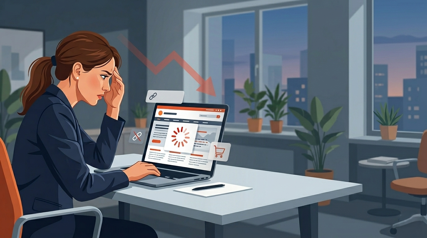
Is your website making you lose customers? Slow loading times are often the main reason. Research shows people will leave if a page does not load in three seconds. For any business that needs leads or sales, slow loading times can mean lost money and lost chances.
This is not just a small problem. It is a big issue in your user experience. Potential customers feel that something is wrong. They leave your site without you knowing they were there. Let's see why page speed is so important and how to make it better.
Proven Fixes to Speed Up Your Website
The good news is you can do simple things to get fast loading times for your site. When you use modern web development best practices, it can help a lot with your website performance. This can also help stop you from losing customers. You do not always need a lot of technical expertise to begin. But some updates may need a developer.
Start by checking your site's Core Web Vitals with Google's free tools. These tools will help you know the parts that slow your site down. After that, you can use well-known ways to fix the problems you see.
Here are some good ways to help your website load faster:
- Optimize images: Make images smaller by compressing them. Use new types like WebP to help lower file size without losing how good they look.
- Leverage Modern Frameworks:Go with tools like Next.js that give you fast speed, easy code splitting, and server-side rendering.
- Improve Hosting: Move up to a hosting plan or service that can take care of your web traffic well.
- Minimize Plugins and Scripts: Check your site and take out plugins or outside scripts that you do not need and that slow things down.
2. Visitors Can't Easily Find Your Phone Number
This one sounds almost too simple to mention, but you would be shocked how many business websites make their phone number difficult to find. It's buried in the footer in small grey text. Or it's only on the "Contact" page, three clicks deep. Or worst of all, it's an image of a phone number, which means mobile users can't tap to call it.
When someone is looking for a service - a plumber, a lawyer, a caterer, they often want to call immediately. That intent is red-hot. If your phone number isn't visible within the first two seconds of landing on your page, that person picks up a competitor's phone number instead. You just lost a warm lead to someone who simply made their number more visible than you did.
Your phone number should be in your website header, clickable, on every single page. This one change alone has measurably improved conversion rates for every client I've implemented it for.
3. The Mobile Layout Is Broken or Difficult to Use
Today, over half of web traffic comes from mobile devices. A poor mobile experience is not okay anymore. If your website was made just for desktops and not changed much for smaller screens, then you are not helping most of your visitors. A poor user experience will not just make people feel upset. It will also hurt your business growth.
A website that is hard to use on a phone can make people leave right away. This can happen when the text is too small, buttons overlap each other, or forms are too hard to fill out. These things show a poor mobile experience. Let’s talk about the signs of a poor mobile experience and how you can fix them.
Signs Your Site Isn't Mobile-Friendly
Do you want to know if your website is not doing well on mobile? There are some signs that can help you figure this out. The biggest sign is a high bounce rate from mobile users in your Google Analytics. If people come to your site on their phones and leave right away, this is a problem. A high bounce rate here means something is wrong, and you need to fix it.
Another sign to look for is not having a responsive design. A good website should change its layout to work well on any screen size. If the mobile version is just the desktop page made smaller, you will run into usability issues. People should not need to pinch and zoom to read the text or click a button. A true responsive design makes everything easy to read and use on any device.
Here are some warning signs that show your website is not good for mobile phones:
- The text is very small, so you have to zoom in to read it well.
- The buttons and links are too close together, which makes it hard to tap the one you want
- The page is wider than the screen, so you have to scroll side to side to see all of it.
- Pop-ups or ads show up over the main content, and they can be hard to close.
Actionable Steps for Improving Mobile Usability
Making your mobile experience better can help a lot with your online presence. The idea is to use best practices so your site is easy and fun to use on mobile devices. A good way to start is by thinking “mobile-first.” This means you should design for the smallest screen first. Then you can make it work for bigger screens later
Making your mobile experience better can help a lot with your online presence. The idea is to use best practices so your site is easy and fun to use on mobile devices. A good way to start is by thinking “mobile-first.” This means you should design for the smallest screen first. Then you can make it work for bigger screens later
Here are actionable steps you can take:
- Implement Responsive Design: Make sure the layout of your website changes so it works well on different screen sizes.
- Simplify Navigation: Use a simple menu, like a hamburger menu, so everyone can get around your site easily, even on a small screen.
- Optimize for Touch: Make buttons and links big enough, with space around them. This lets people tap them easily.
- Test on Real Devices: Check your site on several phones and tablets now and then to spot and fix any usability issues.
4. Your Content Talks About You Instead of Your Customer
Open your homepage right now. Count how many times the words "we," "our," or your business name appear in the first paragraph. Now count how many times the words "you" or "your" appear.
If the "we" count is higher, your homepage is written from the wrong perspective. Customers don't visit your website to learn about you, they visit to find out if you can solve their problem. The businesses that convert the best write their websites from the customer's point of view, leading with the specific problem they solve and the specific result clients see.
Compare these two homepage opening lines:
- "We are a 10-year-old company providing high-quality construction services in Ahmedabad with a team of 50 skilled professionals."
- "Get your home built on time and within budget, with a construction partner trusted by 200+ Ahmedabad families."
Both say similar things. But one speaks to the customer's actual concern (on time, within budget), and the other focuses on the business's own credentials. Rewriting your homepage copy with this shift in perspective can dramatically improve how long visitors stay on your site and whether they reach out.
5. You Have No Clear Call to Action on Each Page
A visitor lands on your Services page. They read about what you offer. They're interested. Now what? If there's no visible next step - no "Get a Quote" button, no "Call Us Now" link, no "Book a Free Consultation" form the visitor's momentum dies. They think about calling, but they'll do it later. They close the tab. They never come back.
Every single page on your website should answer the question: "What do I want this visitor to do next?" And that action should be obvious, prominent, and frictionless. This is what marketers call a "Call to Action" (CTA), and having one or ideally, having one at the top and one at the bottom of longer pages, substantially increases the percentage of visitors who actually reach out to you.
6. Your Website Ranks for Nothing - Not Even Your Own Business Name
Try this experiment: Google your own business name and city. Does your website appear on the first page? Now try searching for the service you provide, something like "clinic near me" or "bakery Bopal" or "accountant CG Road." Do you appear anywhere in the first three pages?
If the answer is no to both, your website has a serious SEO problem. This isn't just about missing some potential organic traffic, it means that people who are actively searching for exactly what you offer cannot find you. Every day that goes by without your website ranking is a day your competitors are capturing customers who should have been yours.
Technical SEO issues, missing meta descriptions, poor page loading speed, no schema markup, no Google Business Profile connection are often the culprit. These are fixable, but they require someone who knows what they're doing to diagnose and correct properly.
7. Weak Visual Design and Branding Issues
People notice the look of your website right away. The first thing that visitors see is the visual design. A site that looks old or not put together can hurt your brand reputation. It can also make your business look like it is not professional. If your website has different colors or fonts that do not match, it hurts trust. This also makes your brand identity weaker.
These design elements are not only for looks. They also tell people about your company's trustworthiness. Let's see how you can spot design choices that are old and know what they do to the way customers see your business.
Identifying Outdated Design Elements
There are some problems on your website that can harm your business even if you don't see any clear errors. One big problem is having old design elements on your pages. A site that looked modern in 2019 may now feel old and not very professional because design trends and what people expect change fast. The first thing you need to do is spot these old design elements. This will help you update your site and fix usability issues
One big red flag in website design is using generic stock photos. People in fake poses or business suits do not connect with your audience now. A website will also feel unprofessional if there is too much text, lots of animations that distract, or many colors and fonts all mixed up. These things can make your site look messy and not good for visitors.
Here are some design elements to look for:
- Low-resolution images or pixelated graphics.
- Inconsistent fonts and color schemes on different pages.
- A design that does not work well on mobile devices and looks broken.
- Cluttered layouts that do not have a clear visual order or enough white space.
Conclusion
To sum it up, how your website works is very important to your business. Slow load times and old content can make it hard to grow. These problems can turn away possible new customers. If you fix these things, you can give people a good user experience. A good site helps keep people on your page and can turn them into steady customers. You need a user-friendly site to make your business last. If you feel ready to make your website better, you can get a free consultation. We can help you find and fix what slows down your business!